Recent work i've created
View all work »-
01 UX-Product Design
- Voice - Blockchain Social Media App »
- Gatorade - Sweat with the Best »
- Impact Journals - UX Redesign »
- Undisclosed - Financial Enterprise App »
-
02 Visual UI Design
- Mtn Dew - Gamer Hub »
- Vans Foods - Web Redesign »
- Mtn Dew - Assemble the Avengers »
About Me
View my full Experience »
-
I’m an enthusiastic design leader, passionate about everything from building teams to nerding out about human psychology. I'm experienced in all facets of Product Design and know what it takes to be a successful Design group within a software organization. I can illustrate. Present. Inspire. Evangelize. Mentor. Teach. I'm currently the Director of Product Design at Ozmo, growing a small but mighty design practice. ...read more

Mtn Dew
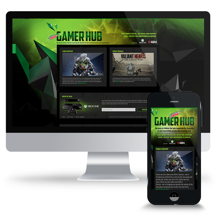
The Mtn Dew Gamer Hub
Mtn Dew wanted to branch further into the Gamer Audience. The task at hand was to quickly design and develop a modular platform, that was responsive and could expand and contract depending on which international market the site was being both visited and managed.
Not only did the site need to be extremely flexible with content, but it needed to share the gaming entertainment space in a relevant way, where Dew and Doritos could find their fans, give them appropriate content while also luring them in with promotions and deals that only Dew, Doritos and XBox could.
As the Lead Digital Art Director, I lead a team of competitive designers through several phases of rapid design concepting. Each designer, including myself, could produce as many concepts around our modular architecture as desired, but ultimately only one concept would move forward.
My Role: UX Design, IA Architect, Art Direction, Usability Expert
The Pitch
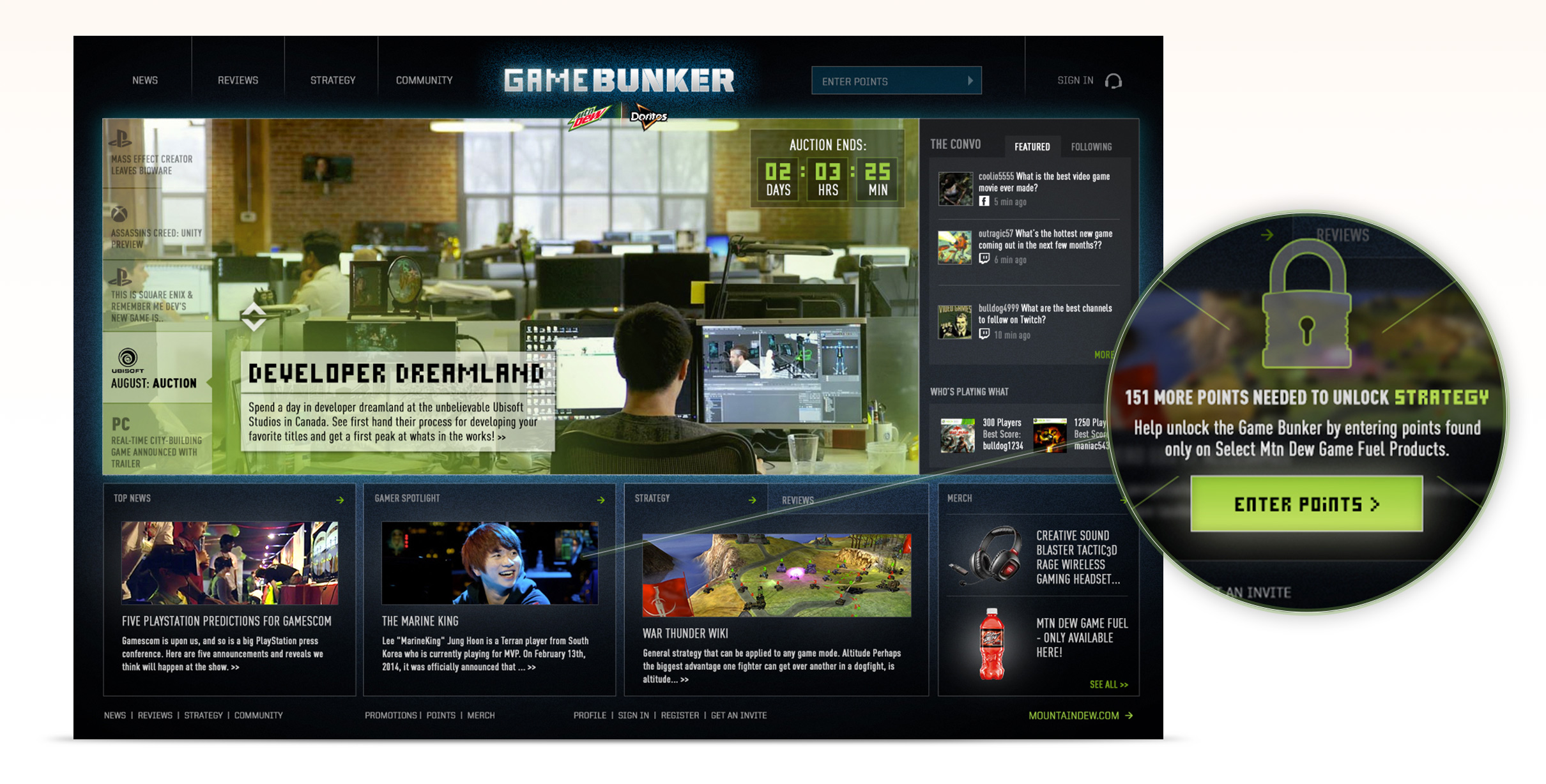
Before the project ever came to be, we were invited by Mtn Dew to pitch for the work itself. I quickly plotted out a rough visual idea of what could be valuable to the gaming audience from the perspective of Mtn Dew. The space was already saturated with other services such as Twitch, so the idea needed to focus less on providing the same experience and content - but establish a community presence for Dew drinkers that were Gaming fans as well.
Winning Details of the Pitch
Painting a picture for clients during pitch processes was critical. Rather than simply describing what could be, I laid out some examples that told the story of our idea more clearly.
I envisioned a customizable interface for Users - something gamers might already be familiar with. I also brought to life some of the aspects that Dew could really facilitate - Pro Gamers, Dew-only content, and Dew giveaways.
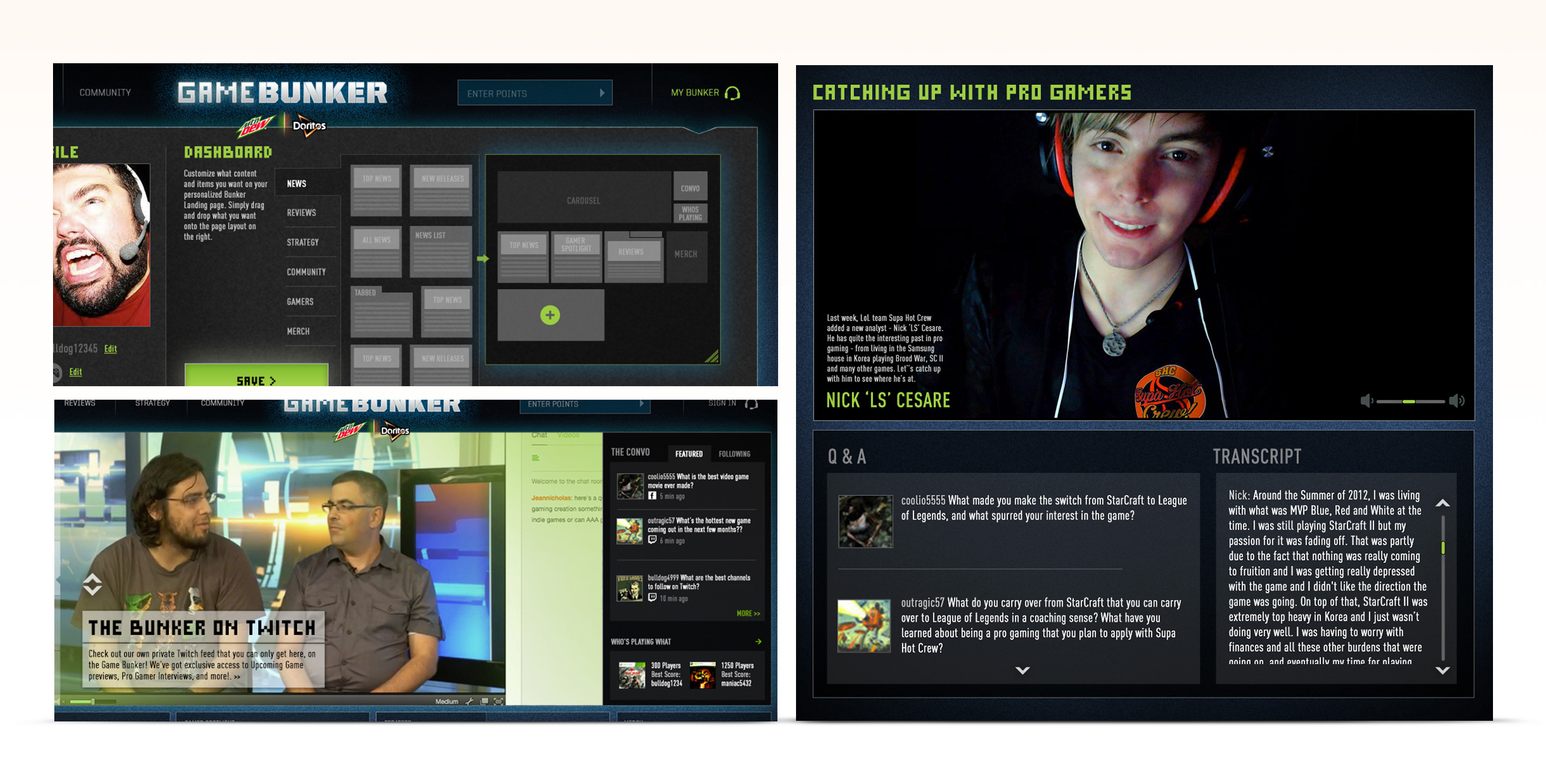
Early Concpets
Once the project was won, I moved rapidly through IA and UX. We defined the module requirements that could possibly go into a version of the site and gave the visual design as much freedom as possible on top of a defined architecture.
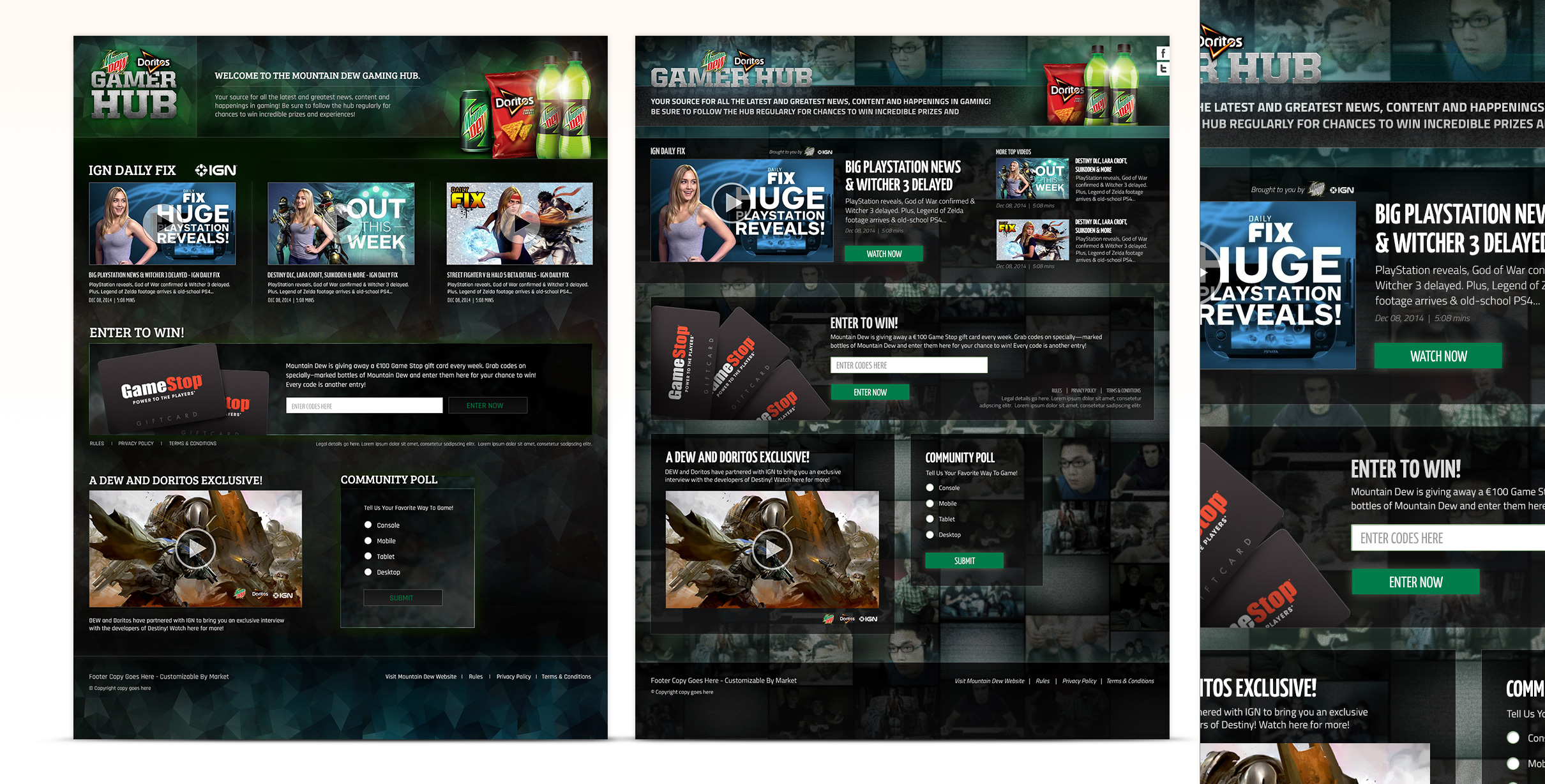
I moved into fleshing out modules in more detail, and ensuring all responsive design considerations had been made. My two concept variations were slightly different in structure, pushing some ideas and constraints of a modular system.
Both were dark and moody, leaning into the Gamer space. The concept on the left pulled in more geometric elements from the current Dew brand, while the other idea utilized a background grid of videos of Gamers famces in action.
Final Responsive Design
The final design brought even more geometric elements and Dew green into the look and feel for a dramatic and energetic style. Textures and vibrant lines kept it feeling like Dew while leaving room for the Gaming content to come to life.
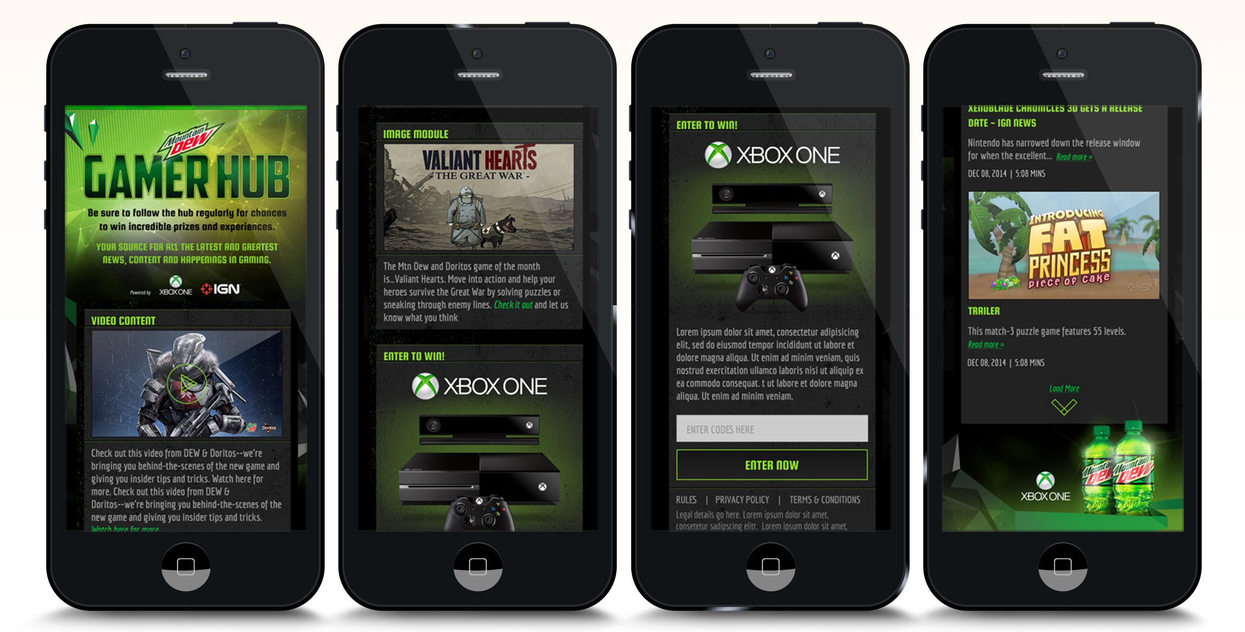
The modular UX resulted nicely in a single column format for smaller devices.
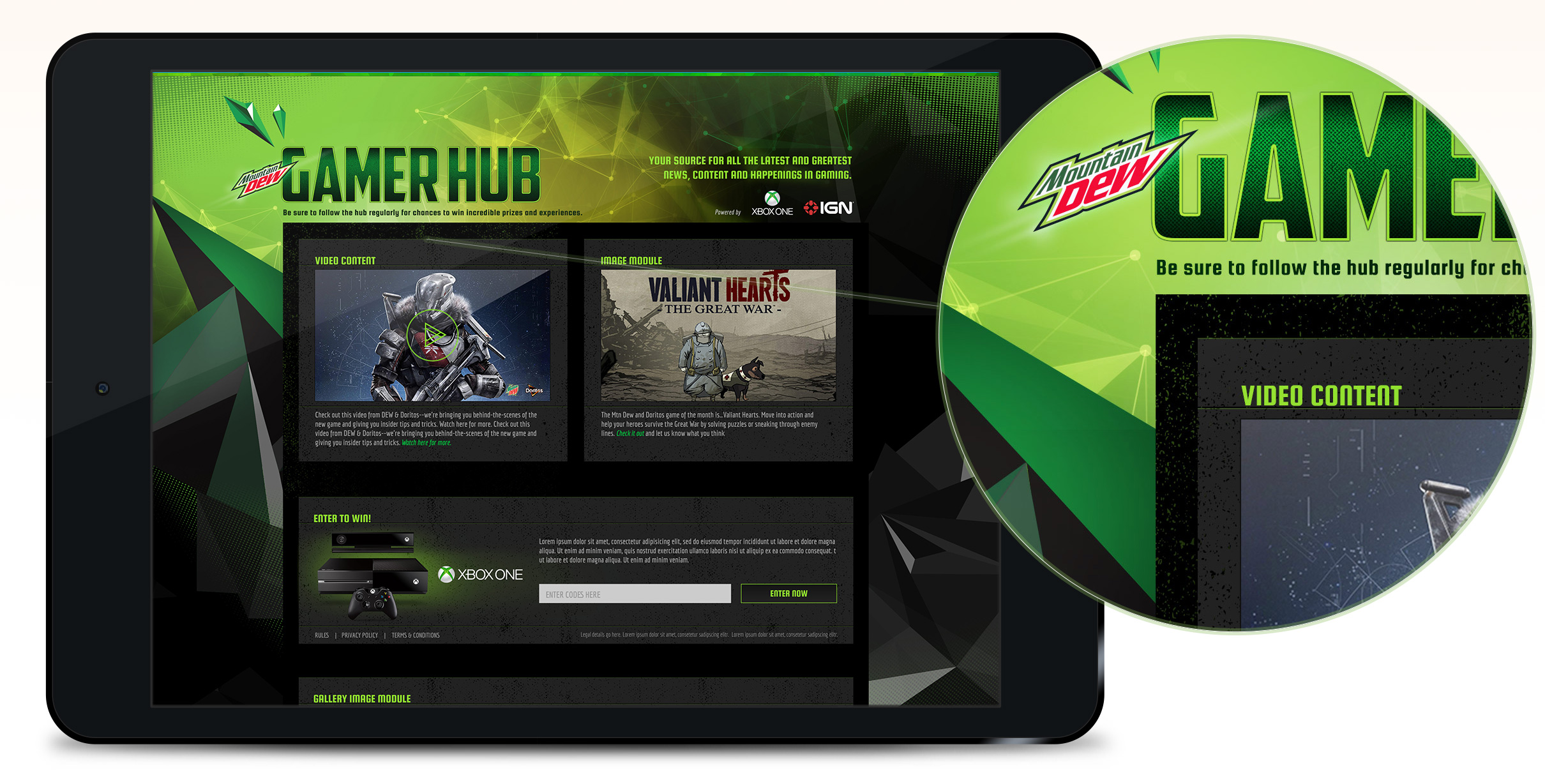
Final Design in Detail
This design was truly built around the detail in the textures and design elements surrounding the content. These Users and gaming fans would be totally accustomed to high fidelity visuals from their games and this design leaned into that space.

Selected work I've created
-
01 User Experience
- Gatorade - Sweat with the Best »
- Exadel - Responsive Redesign »
- Impact Journals - UX Redesign »
- Visit San Antonio - Tourism and Booking Web Platform »
-
02 Branding
- Exadel - Rebrand »
- Soapbox Marketing - Branding »
-
03 Product Design
- Voice - Blockchain Social Media »
- Verizon Wireless - Device Simulator »
- Undisclosed - Financial Enterprise App »
- FEMA - Community Rating System »
-
04 Usability
- Image Processing - Usability Study »
-
05 Visual / UI Design
- Mtn Dew - Gamer Hub »
- Vans Foods - Web Redesign »
- Mtn Dew - Assemble the Avengers »
-
06 Packaging Design
- Native Eyewear - Packaging Concepts »
- Mtn Dew - Spiked Lemonade »
-
07 Campaign Design
- 3M - Telecom Division »
- Mtn Dew - Black Label »

Some things I enjoy
Human Factors and Psychology, Ideation, Collaboration, UX Research, Strategy, User Personas, User Stories + Flows, Information Architecture, Wireframing / Prototyping, Art Direction, Mentoring / Teaching, Hierarchy, Visual Design, Leading Teams, Illustration, Conceptual Thinking, Live Music, Veggies, Beers, Hiking, And long walks on the beach.
You’ve reached the bottom, kudos. Jump to My Work, Learn About my Experience or Get in Touch. Perhaps, you'd like to return to the top?
© Tony Phillips