-
Exadel /
-
Redesign
Exadel
After bringing Exadel through a rebranding process, I needed to update our website and bring it into a better storytelling platform, where the services and offerings of Exadel could lead to conversion and generate sales.
✉ Contact me to discuss this product and work in more detail.
Working directly with the executive team and the marketing director, we collaboratively generated a high-level idea of our future content structure.

Rebranding
-
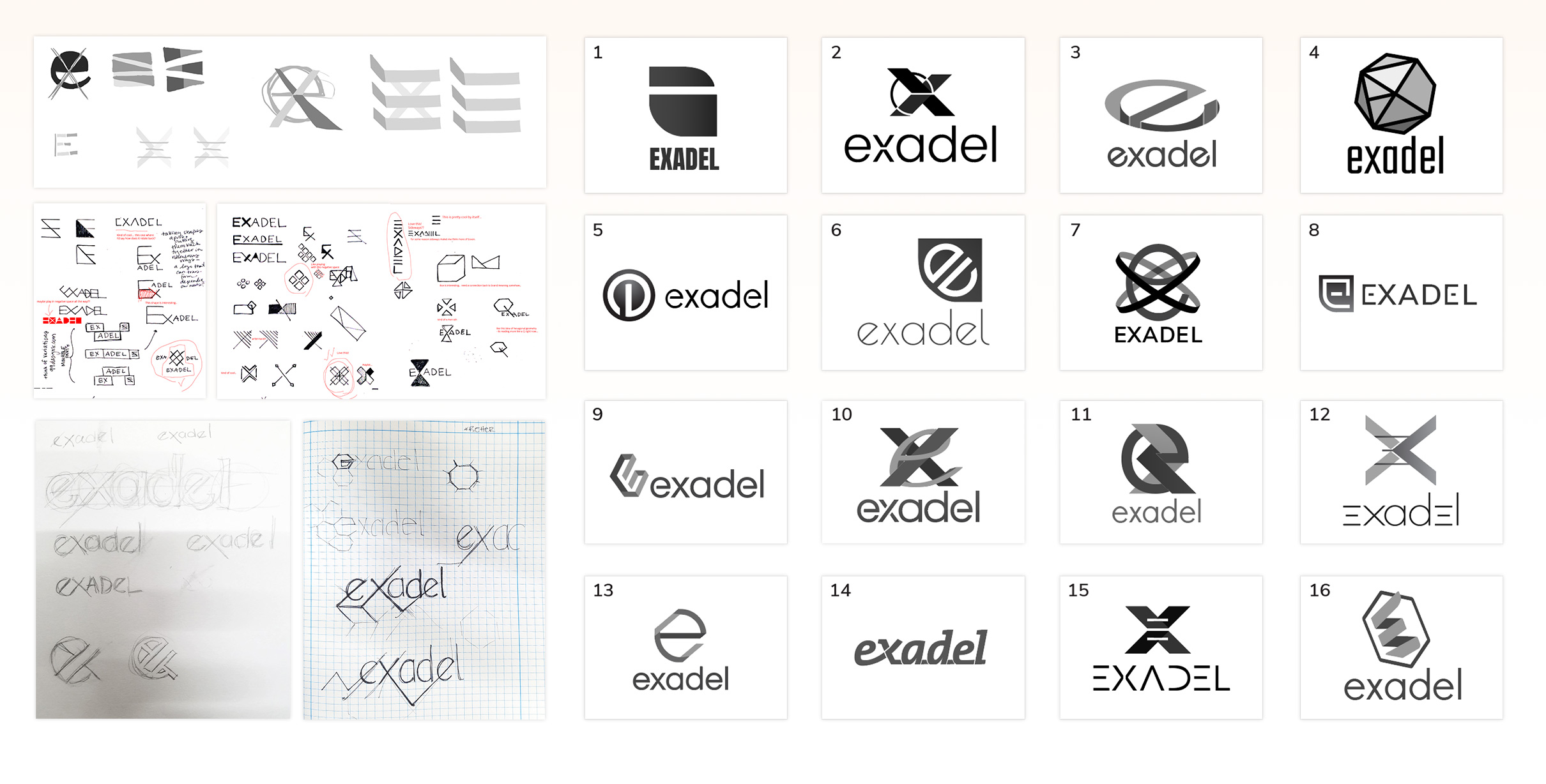
Working with my team of Designers, I lead all of through several rounds of ideation and sketching, always regrouping as a team for shared thoughts and critiques.
Ultimately, after several rounds of brainstorming, I took our top ideas and concepts and developed more refined digital versions in Illustrator, seen on the right.
Next came several rounds of circling these refined ideas around the Executive and leadership teams, for further refinement and buy in. A lot of this process came in the form of Internal Presentations, educating Executives on how these concepts alluded back to our newly developed Brand Guidelines.
Spring concept
-
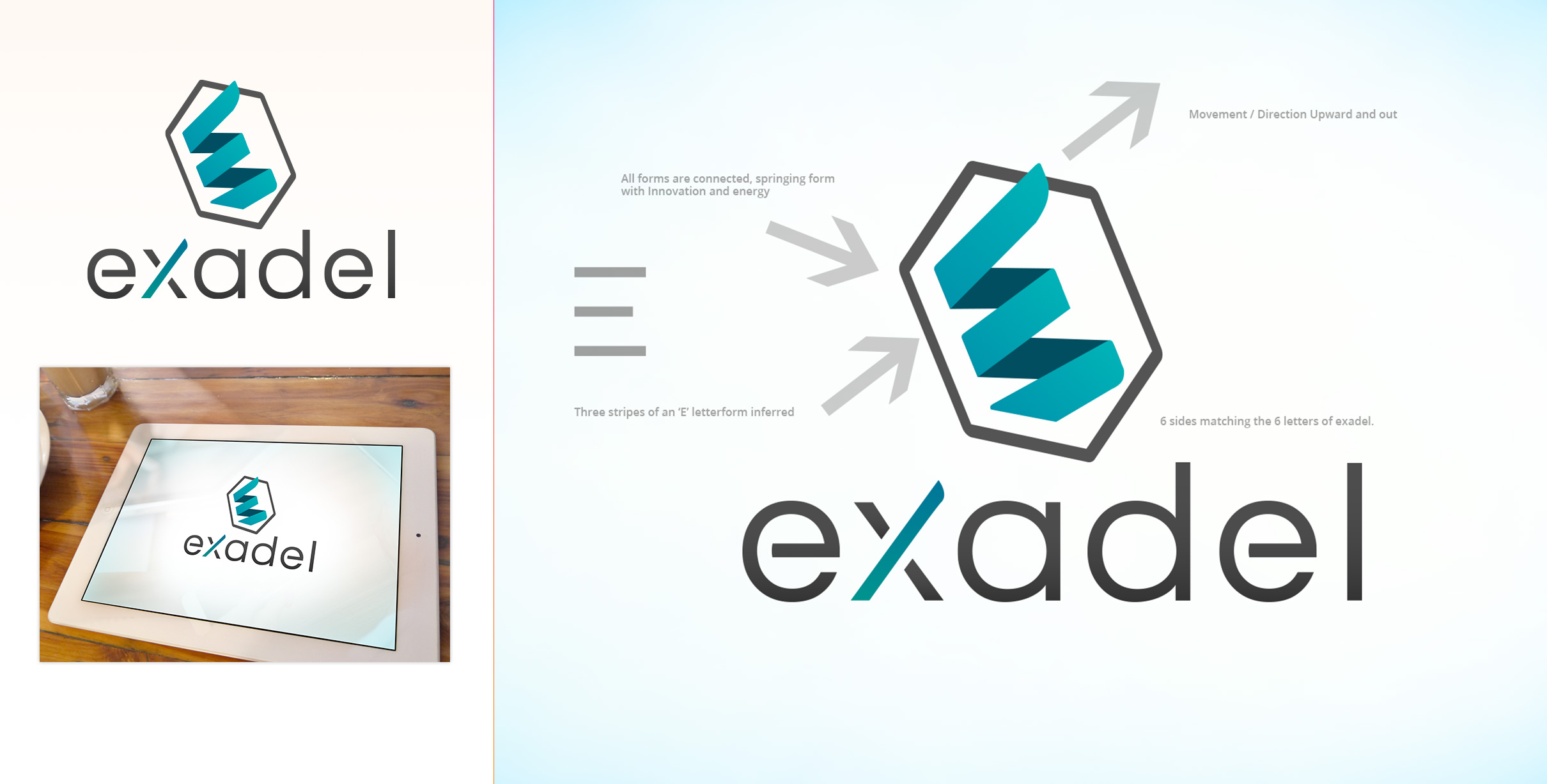
I narrowed our concepts down to a final 3. At this point, I knew some of our color palette would be centered around Blue, which i began to incorporate to better bring these ideas to life for further decision making.
This concept captured movement, an abstract interpretation of the E letterform, and represented a connective tissue - all important aspects of communicating our new brand.
The lowercase word mark was also critical in the new identity, as we wanted to moved away from the more formal and stale uppercase previous logo.
Overall this concept felt approachable, energetic and modern.
Grounded Concept
-
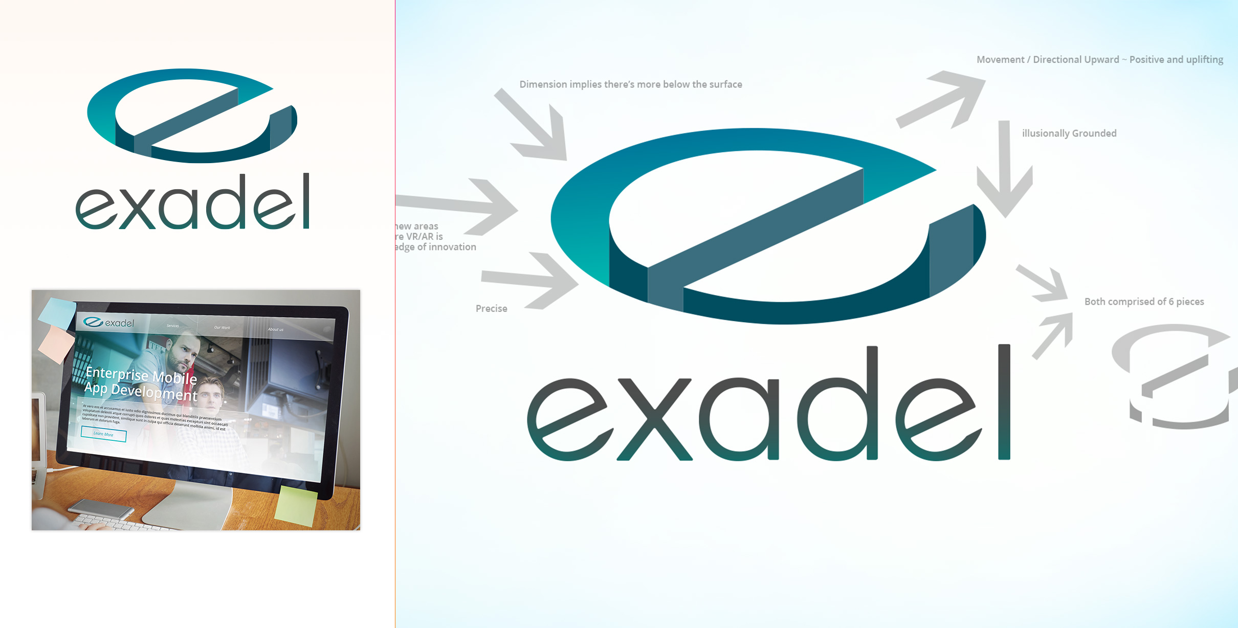
This concept pulled in more heavily the lowercase 'e' letterform. However, the interesting aspect of this concept was that the logo mark appeared to drop down into the surface - which paired nicely with the idea of a lot of what made Exadel great at software was beneath the surface, not always immediately seen.
Dimensional Concept
-
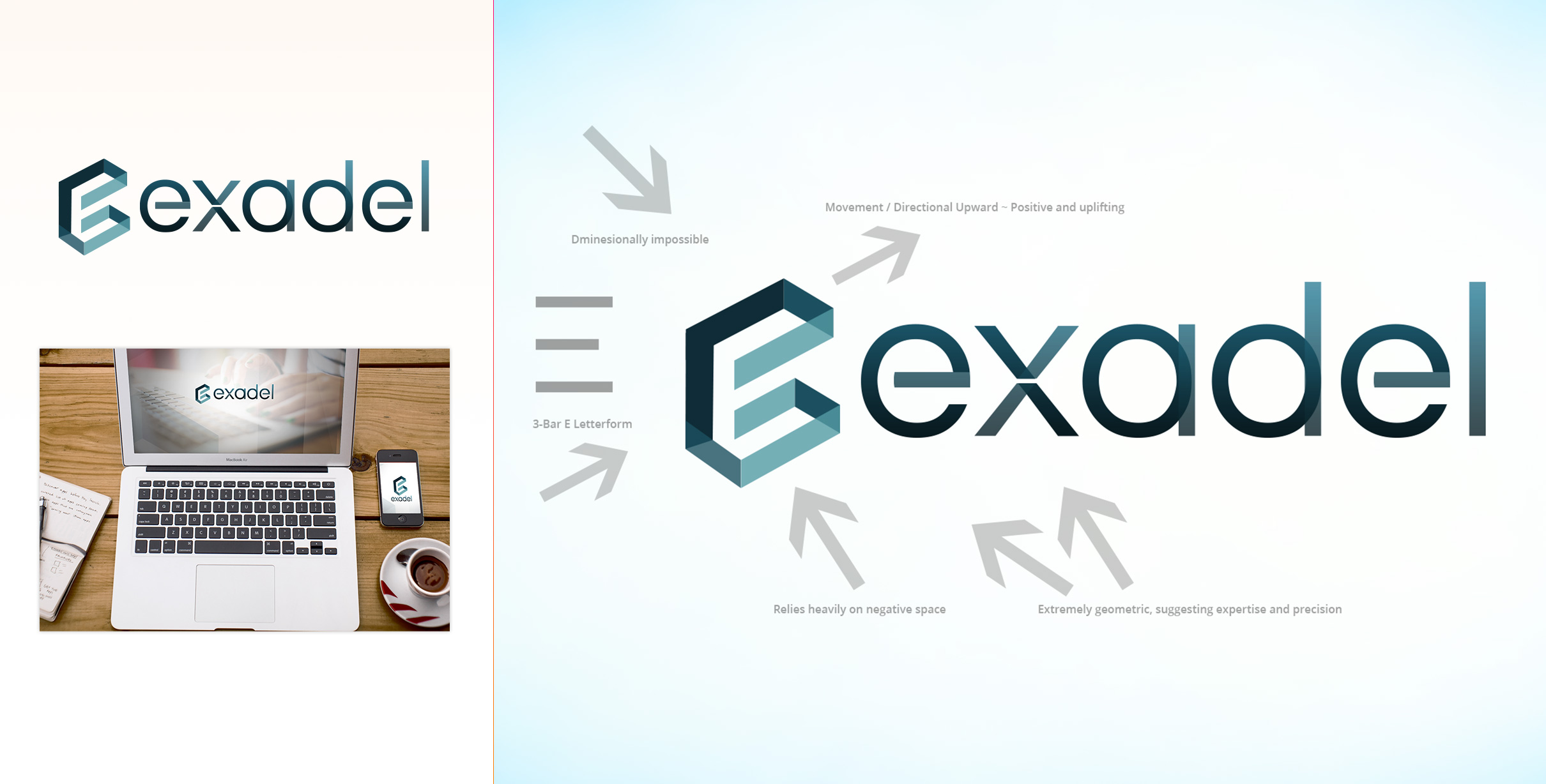
This concept leaned heavily into geometry and dimension, while still capturing a hint of the old, capital 'E' and making it part of the new identity.
I still featured an upward and outward, positive movement. This concept also abstractly danced around an impossible dimensional shape, which as a mark, added a little playfulness.
Refreshed brand
-
The final concept was chosen, and now it was time for additional refinement and iteration.
My team and I worked on improving rhythm, creating evenly spaced and shaped, perfectly geometric letterforms within the word mark. We also corrected and improved the Logo mark, by adjusting the perspective so it became more realistically depicted in depth.
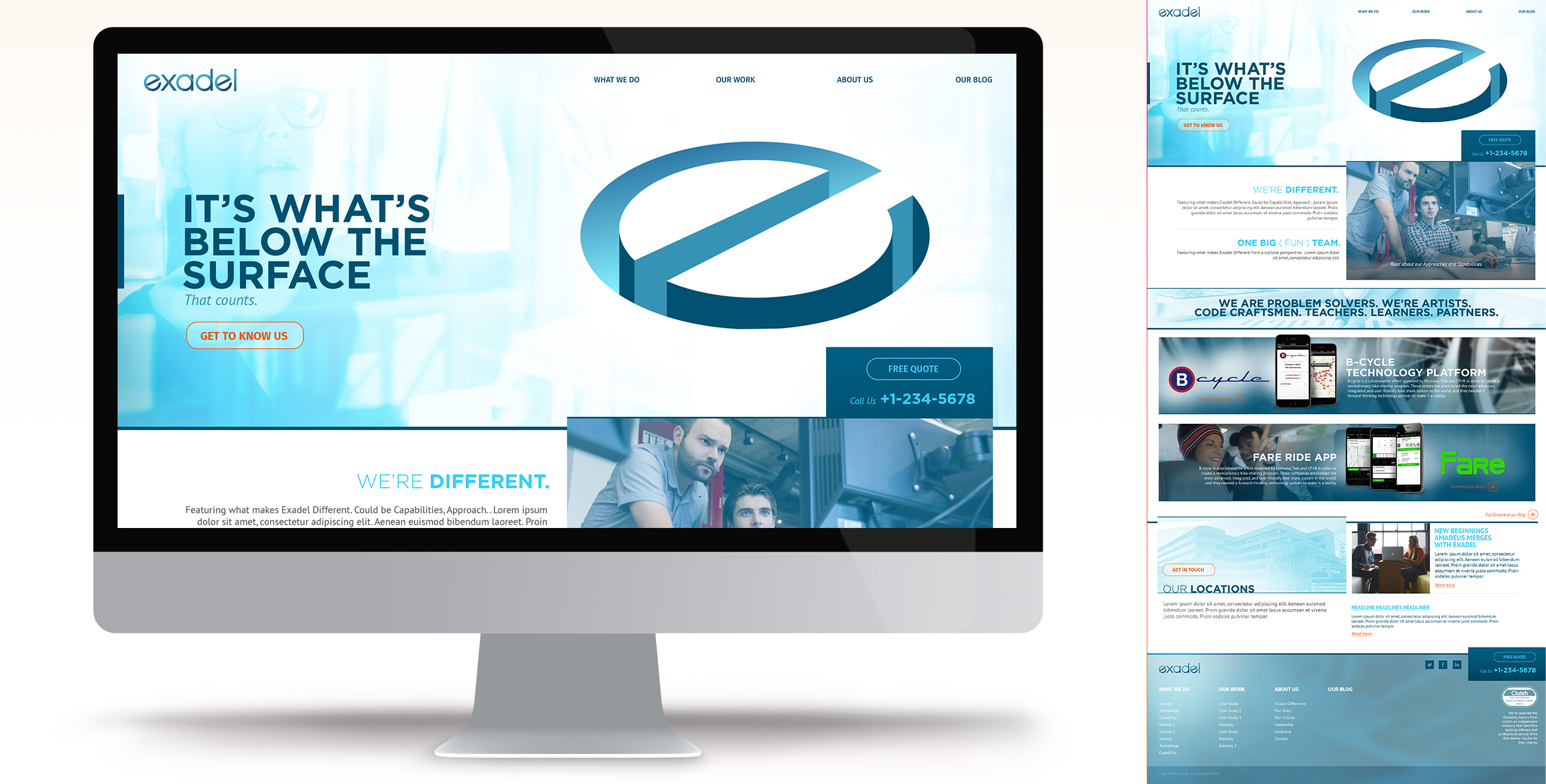
Rapid information architecture and prototyping
-
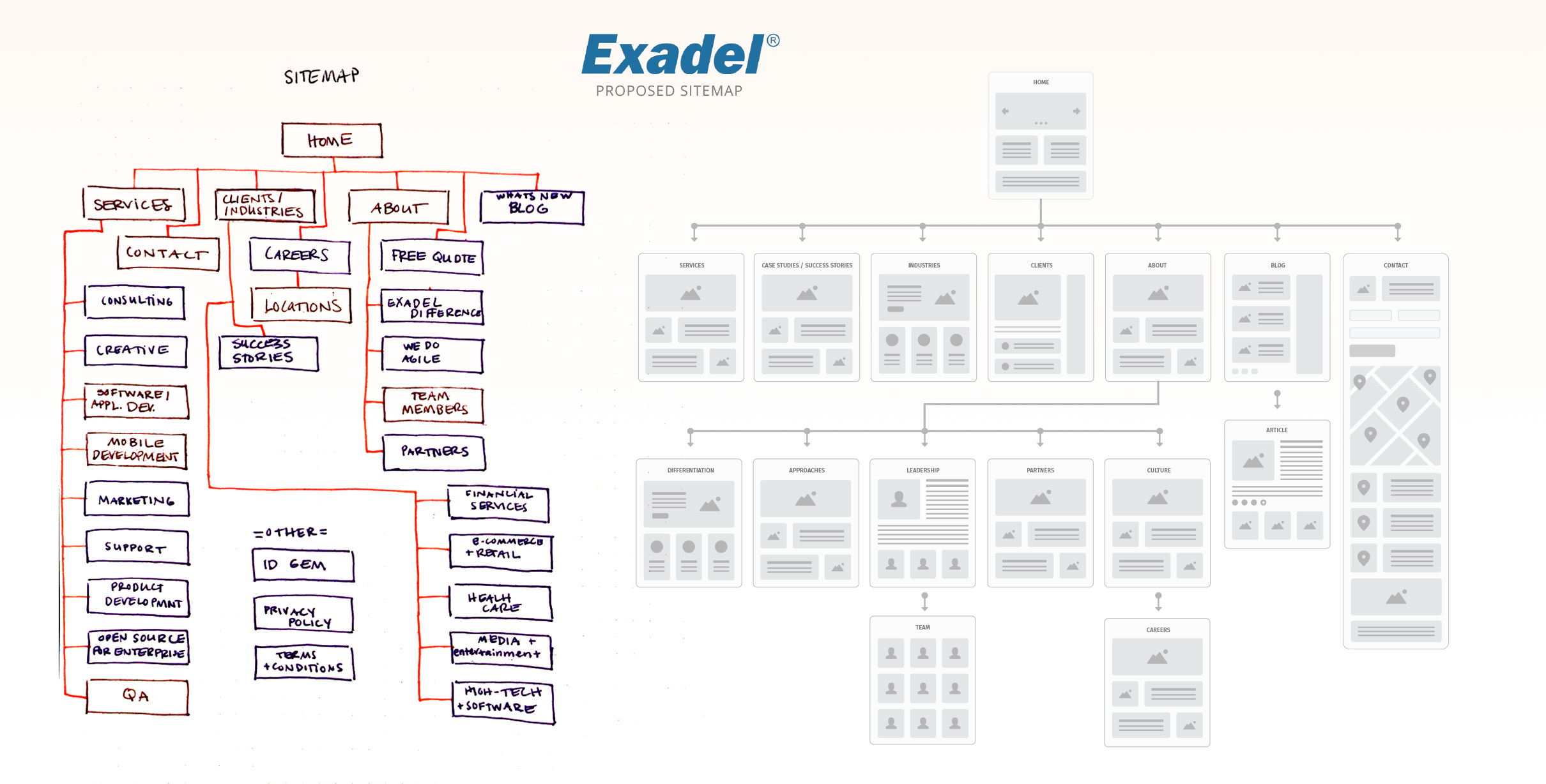
The need to move quickly was imperative. Working with my team of Product Designers, we rapidly plotted out an architecture for the new site.
To continue in our fast pace, I produced a Paper prototype, which I was able to gain participation and experimentation from the Leadership Team. Building this rapid prototype enabled all of us to quickly iterate and jump into designs.
Goal oriented User Journeys
-
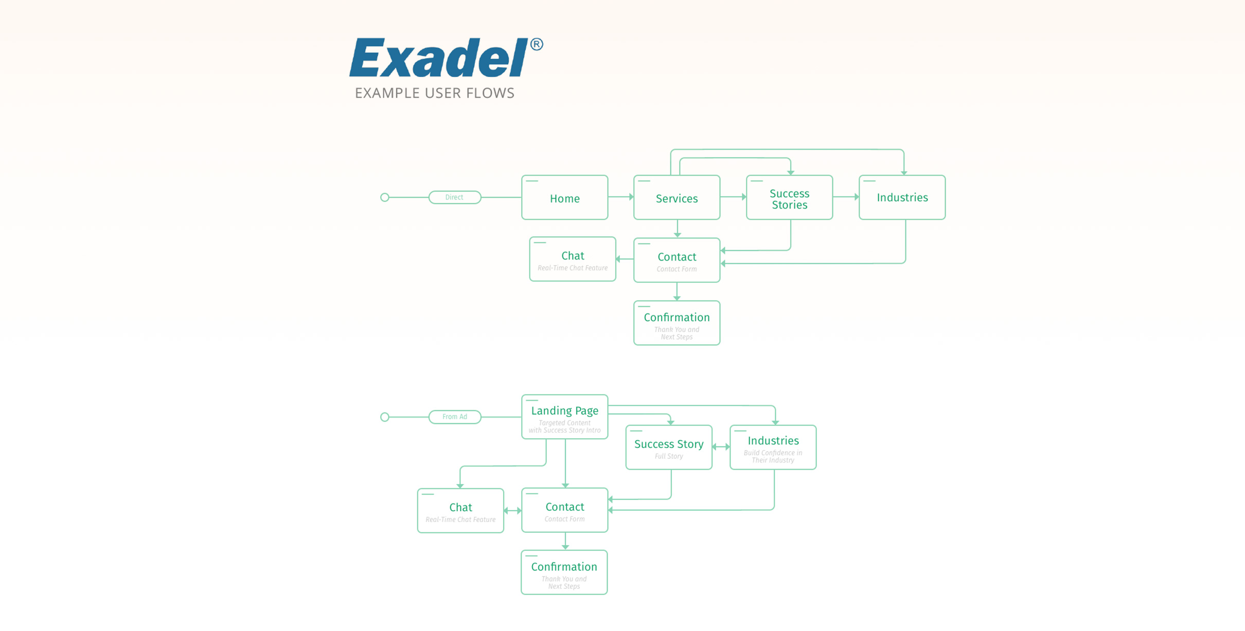
As lead generation was critical for the new site, my team and I plotted out User Journeys that captured imperative paths through our intended architecture.
Design direction
-
To generate as many Visual ideas as possible, I lead my entire team of Designers through an exercise of exploring a few key pages in design application. Each designer, including myself, came up with design ideas that we collaboratively iterated on as a team.
Here you can see one of my concepts, this one focused on blues and also highlighting some endued meaning within our new brand.
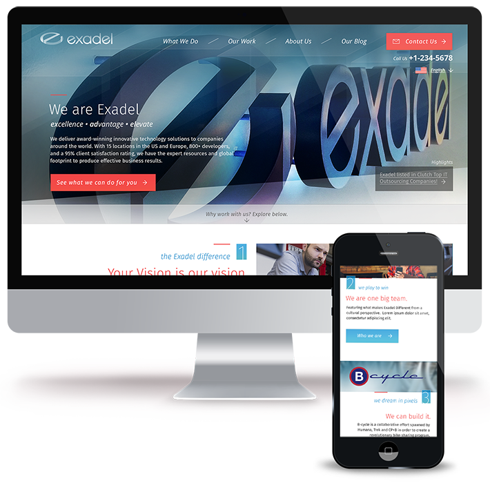
Final Design
-
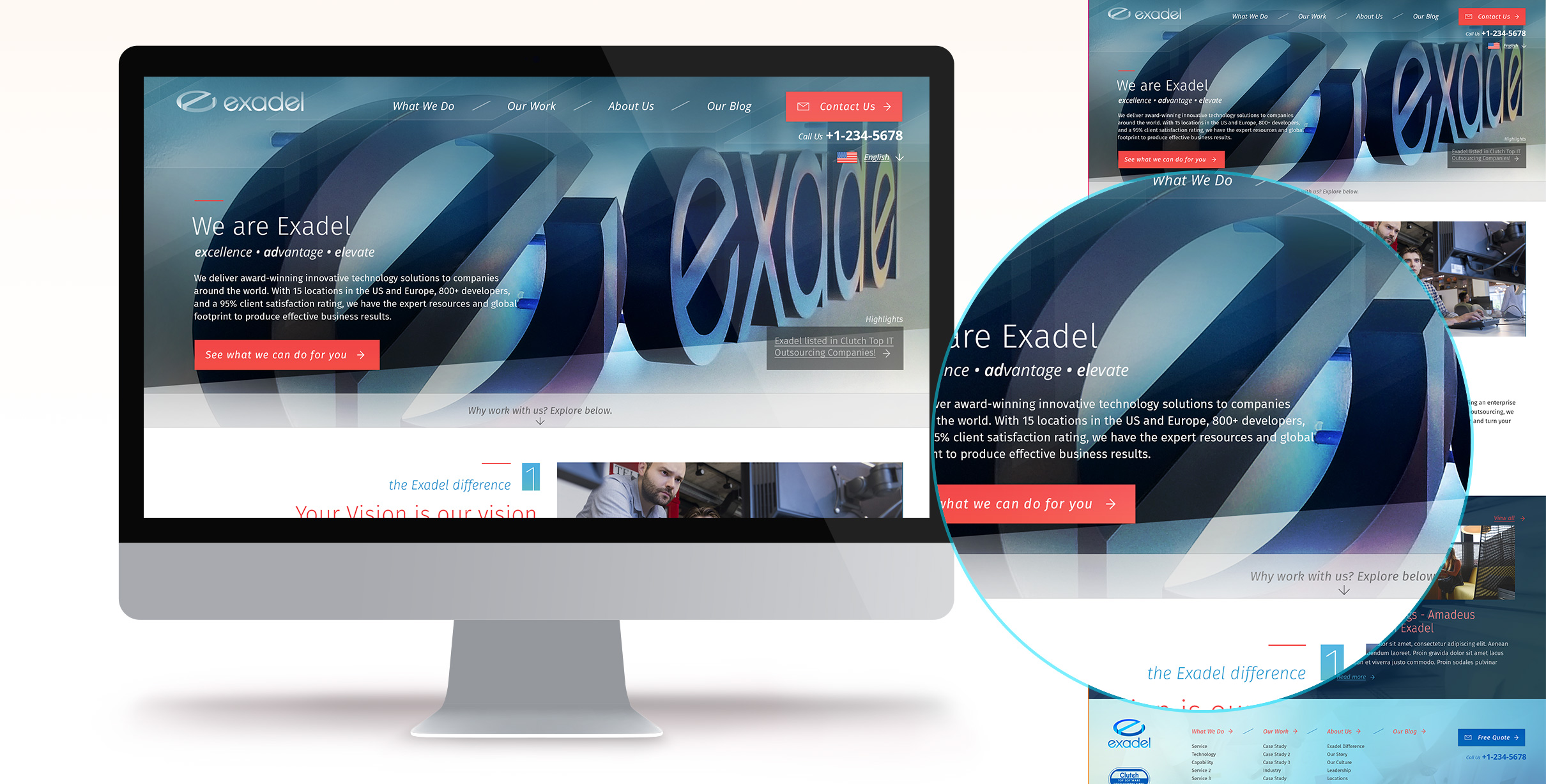
After designing the complete site and page templates, we circled back around to the overall look and feel for one more pass.
I refined the grid and spacing while introducing a few more features, such as localization and a highlights widget for news and pr related items.
Most importantly with the final aesthetic passover, was pulling more of the header image forward - creating a more dynamic and impactful first impression for Users.
Internal page templates
-
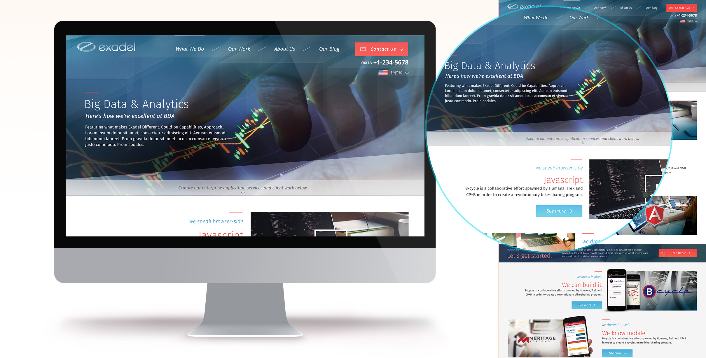
Again, the background header imagery was shown in more vibrant detail.
Here, another new inclusion can be seen - a directional strip, pushing Users to continue reading more about the topic at hand below the header.
Internal page templates
-
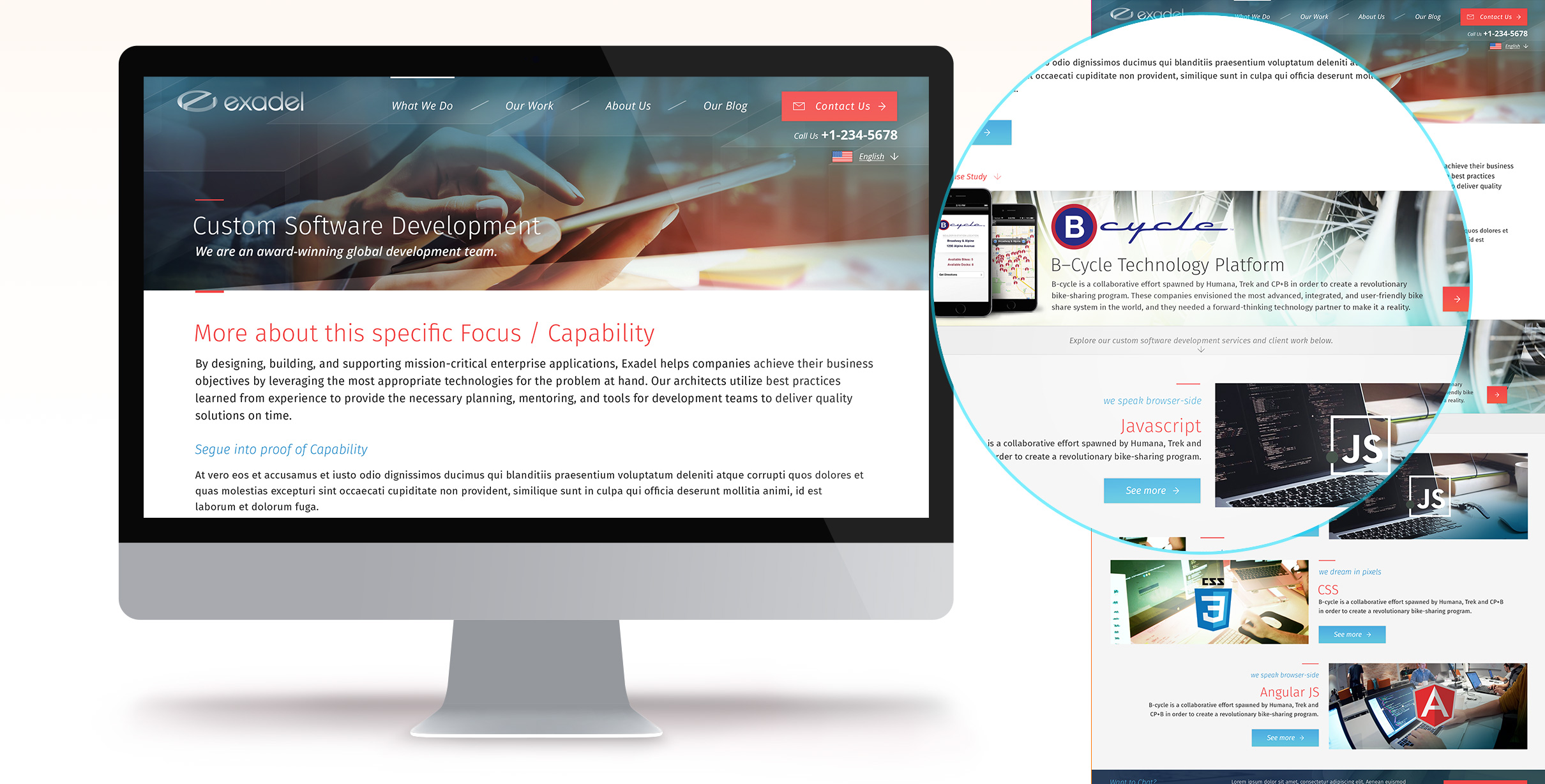
Another variation of Internal Page template shown here, where more messaging and written content is needed.
Additionally, a variation of a Case Study detail can be seen - giving content managers the ability to highlight certain Sucesses even more.
Front end hand=off
-
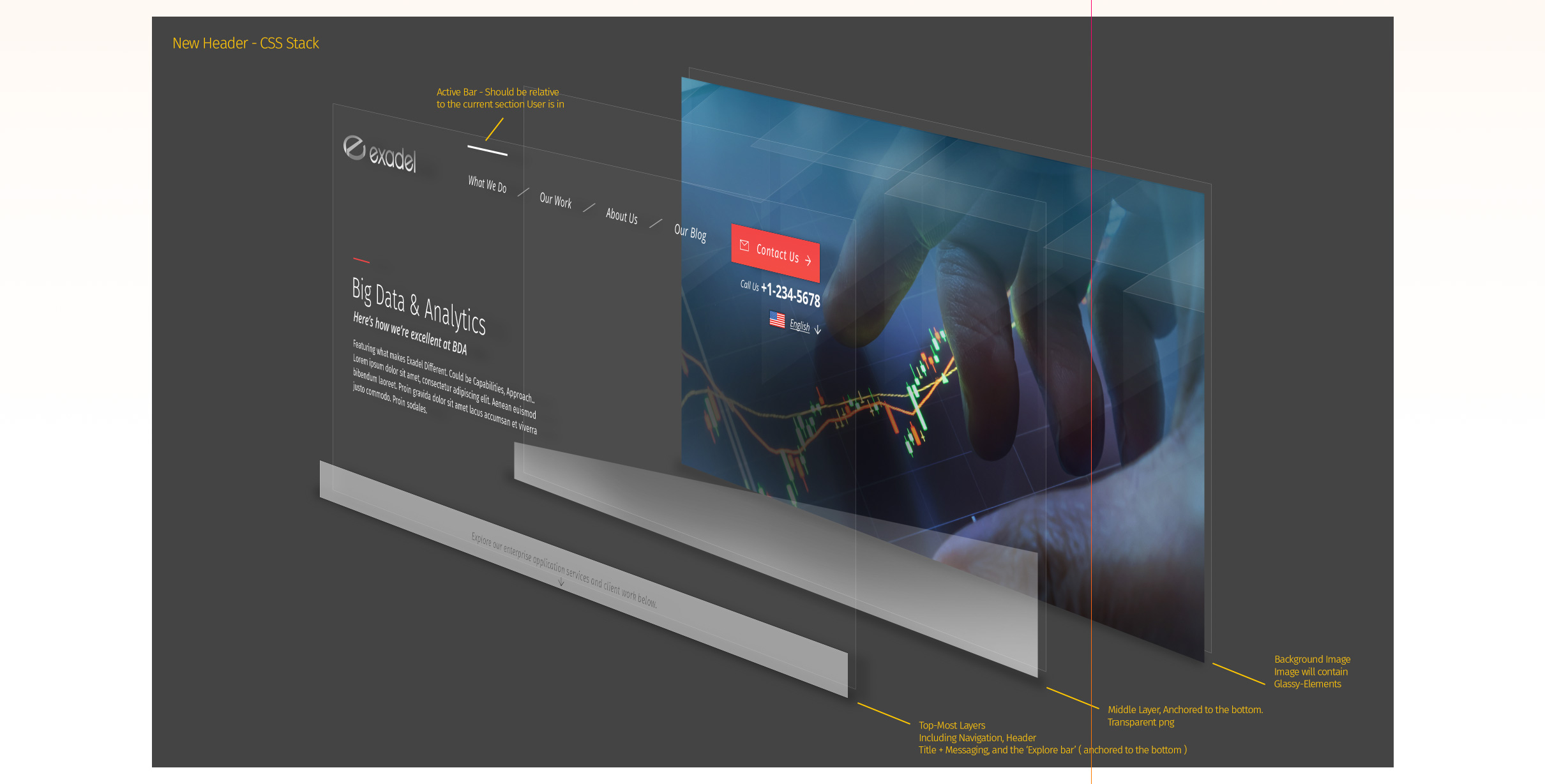
In an effort to make development easier and more efficient, I included this example of how we could approach layering our headers in HTML and CSS, alleviating a good amount of effort on our development teams.